Logistic Regression prediction plots can be a nice way to visualize and help you explain the results of a logistic regression.
Suppose we are investigating the relationship between number of kids less than 6 (the explanatory variable) and whether or not the participant is in the workforce (the response variable). A logistic regression can be used to model this relationship.
Typically, we would run a logistic regression and be able to make a conclusion such as: For each additional child under 6, it is expected that the odds of being in the workforce changes by a factor 0f 0.36. But it would be hard for this to have a tangible meaning to a non-technical audience. It is much easier to be able to SHOW them what that means with a plot!
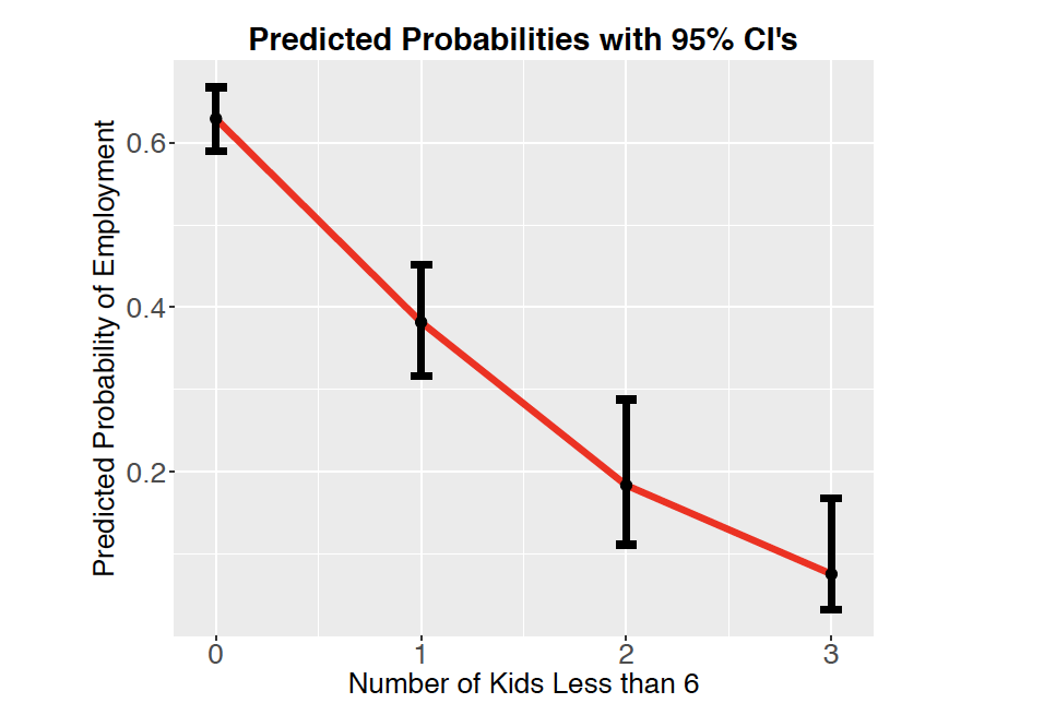
What this allows us to see is how the probability of being in the labor force is expected to decrease with each additional child and how much uncertainty we have on those estimates. For instance, it is shown that 63% of people with no kids less than 6 are expected to be employed, but we have some uncertainty on that estimate. We expect that the true proportion of people with no kids less than 6 is actually somewhere in the interval 59% to 67%. We can also see how someone with 3 kids less than 6 is expected to have about an 8% likelihood of being employed. These types of statements are usually much easier to communicate than statements about odds ratios.
It is possible to show the findings of two explanatory variables as well. This might look something like:
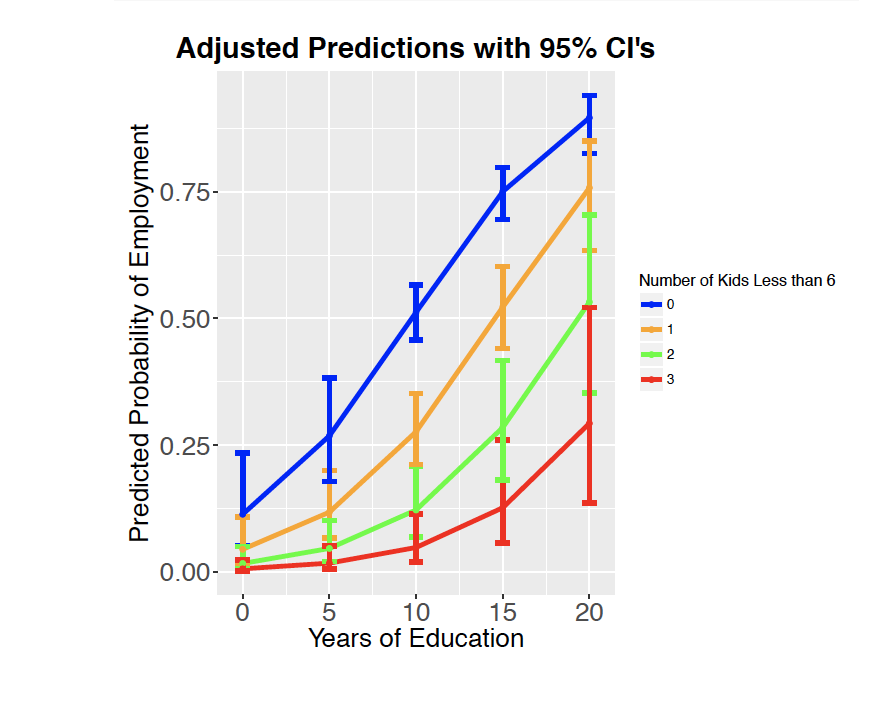
Can you make sense of what this plot is trying to show?
To construct these plots you will generally need to follow the code below. Notice that your code must start with your logistic regression code.
You will want to start with a simple model that includes only a single explanatory variable.
Visualizing a single explanatory variable
import numpy as np
import pandas as pd
import statsmodels.api as sm
import matplotlib.pyplot as plt

# Replace with your actual DataFrame
# mydata = pd.read_csv("your_data.csv")

# Fit logistic regression
X = mydata[['Explanatory1']]  # Replace with your actual variable name
X = sm.add_constant(X)        # Add intercept
y = mydata['BinaryResponse']  # Must be 0 or 1

mod1 = sm.GLM(y, X, family=sm.families.Binomial()).fit()
print(mod1.summary())
Predict Probabilities + Confidence Intervals
# Create new values for prediction
graphdata = pd.DataFrame({
    'Explanatory1': np.linspace(mydata['Explanatory1'].min(), mydata['Explanatory1'].max(), 100)
})
X_new = sm.add_constant(graphdata)

# Predict on link scale (log-odds)
pred = mod1.get_prediction(X_new)
pred_summary = pred.summary_frame(alpha=0.05)  # 95% CI

# Convert to probabilities
graphdata['PredictedProb'] = pred_summary['mean'].apply(lambda x: 1 / (1 + np.exp(-x)))
graphdata['LL'] = (pred_summary['mean_ci_lower']).apply(lambda x: 1 / (1 + np.exp(-x)))
graphdata['UL'] = (pred_summary['mean_ci_upper']).apply(lambda x: 1 / (1 + np.exp(-x)))
Plot Predictions + Confidence Interval
plt.figure(figsize=(10, 6))
plt.plot(graphdata['Explanatory1'], graphdata['PredictedProb'], color='red', linewidth=2, label='Predicted Probability')
plt.fill_between(graphdata['Explanatory1'], graphdata['LL'], graphdata['UL'], color='gray', alpha=0.3, label='95% CI')
plt.scatter(graphdata['Explanatory1'], graphdata['PredictedProb'], color='black', s=30)
plt.xlabel("Explanatory1")
plt.ylabel("Predicted Probability")
plt.title("Logistic Regression Predictions with Confidence Interval")
plt.legend()
plt.grid(True)
plt.show()
Now suppose I have two explanatory variables in my model
import numpy as np
import pandas as pd
import statsmodels.api as sm
import matplotlib.pyplot as plt
import seaborn as sns

# Assume mydata is a DataFrame already loaded
# mydata = pd.read_csv("your_data.csv")

# Fit logistic regression with two explanatory variables
X = mydata[['Explanatory1', 'Explanatory2']]  # Replace with real variable names
X = sm.add_constant(X)
y = mydata['BinaryResponse']  # 0 or 1

mod2 = sm.GLM(y, X, family=sm.families.Binomial()).fit()
print(mod2.summary())
Create Prediction Grid and Calculate Probabilities
# Define interesting values (customize as needed)
ex1_vals = np.linspace(mydata['Explanatory1'].min(), mydata['Explanatory1'].max(), 50)
ex2_vals = sorted(mydata['Explanatory2'].unique())  # or manual list like [0, 1, 2]

# Create all combinations
graphdata2 = pd.DataFrame([(x1, x2) for x2 in ex2_vals for x1 in ex1_vals],
                          columns=['Explanatory1', 'Explanatory2'])
X_new = sm.add_constant(graphdata2)

# Predict on link (logit) scale
pred = mod2.get_prediction(X_new)
pred_summary = pred.summary_frame(alpha=0.05)

# Convert to probabilities
graphdata2['PredictedProb'] = 1 / (1 + np.exp(-pred_summary['mean']))
graphdata2['LL'] = 1 / (1 + np.exp(-(pred_summary['mean_ci_lower'])))
graphdata2['UL'] = 1 / (1 + np.exp(-(pred_summary['mean_ci_upper'])))
Plot Predictions with Uncertainty by Group
plt.figure(figsize=(10, 6))

# Line plot with error bars by Explanatory2 group
sns.lineplot(data=graphdata2, x='Explanatory1', y='PredictedProb', hue='Explanatory2', palette='tab10', linewidth=2)

# Add confidence intervals and points manually
for _, group in graphdata2.groupby('Explanatory2'):
    plt.fill_between(group['Explanatory1'], group['LL'], group['UL'], alpha=0.2)
    plt.scatter(group['Explanatory1'], group['PredictedProb'], s=30, color='black', alpha=0.5)

plt.xlabel("Explanatory1")
plt.ylabel("Predicted Probability")
plt.title("Logistic Regression Predictions with CI by Explanatory2")
plt.legend(title="Explanatory2")
plt.grid(True)
plt.show()