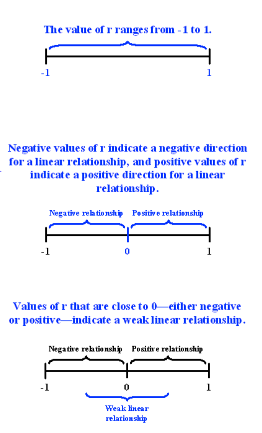
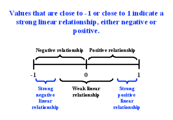
Chi-Square and Correlation
Pre-Class Readings and Videos
Chi-square test of independence
The last statistical test that we studied (ANOVA) involved the relationship between a categorical explanatory variable (X) and a quantitative response variable (Y). Next, we will consider inferences about the relationships between two categorical variables, corresponding to case C→C.
In our graphing, we have already summarized the relationship between two categorical variables for a given data set, without trying to generalize beyond the sample data.
Now we will perform statistical inference for two categorical variables, using the sample data to draw conclusions about whether or not we have evidence that the variables are related in the larger population from which the sample was drawn. In other words, we would like to assess whether the relationship between X and Y that we observed in the data is due to a real relationship between X and Y in the population, or if it is something that could have happened just by chance due to sampling variability.
The statistical test that will answer this question is called the chi-square test of independence. Chi is a Greek letter that looks like this: χ, so the test is sometimes referred to as: The χ2 test of independence.
Let’s start with an example.
In the early 1970s, a young man challenged an Oklahoma state law that prohibited the sale of 3.2% beer to males under age 21 but allowed its sale to females in the same age group. The case (Craig v. Boren, 429 U.S. 190 [1976]) was ultimately heard by the U.S. Supreme Court.
The main justification provided by Oklahoma for the law was traffic safety. One of the 3 main pieces of data presented to the Court was the result of a “random roadside survey” that recorded information on gender and whether or not the driver had been drinking alcohol in the previous two hours. There were a total of 619 drivers under 20 years of age included in the survey.
Here is what the collected data looked like:
| Driver | Gender | Drove Drunk? |
| Driver 1 | M | N |
| Driver 2 | M | N |
| Driver 3 | M | Y |
| Driver 4 | F | N |
| . | . | . |
| Driver 619 | F | N |
The following two-way table summarizes the observed counts in the roadside survey:
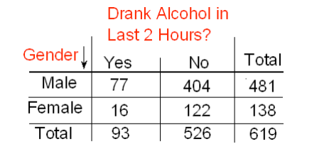
Note that we are looking to see whether drunk driving is related to gender, so the explanatory variable (X) is gender, and the response variable (Y) is drunk driving. Both variables are two-valued categorical variables, and therefore our two-way table of observed counts is 2-by-2. Before we introduce the chi-square test, let’s conduct an exploratory data analysis (that is, look at the data to get an initial feel for it).Our task is to assess whether these results provide evidence of a significant (“real”) relationship between gender and drunk driving.
Exploratory Analysis
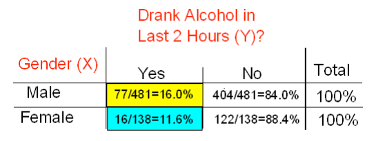
Recall that the key to reporting appropriate summaries for a two-way table is deciding which of the two categorical variables plays the role of explanatory variable and then calculating the conditional percentages — the percentages of the response variable for each value of the explanatory variable — separately. In this case, since the explanatory variable is gender, we would calculate the percentages of drivers who did (and did not) drink alcohol for males and females separately. Here is the table of conditional percentages:
For the 619 sampled drivers, a larger percentage of males were found to be drunk than females (16.0% vs. 11.6%). Our data, in other words, provide some evidence that drunk driving is related to gender; however, this in itself is not enough to conclude that such a relationship exists in the larger population of drivers under 20. We need to further investigate the data and decide between the following two points of view:
- The evidence provided by the roadside survey (16% vs. 11.6%) is strong enough to conclude (beyond a reasonable doubt) that it must be due to a relationship between drunk driving and gender in the population of drivers under 20.
- The evidence provided by the roadside survey (16% vs. 11.6%) is not strong enough to make that conclusion and could just have happened by chance due to sampling variability, and not necessarily because a relationship exists in the population.
Actually, these two opposing points of view constitute the null and alternative hypotheses of the chi-square test for independence, so now that we understand our example and what we still need to find out, let’s introduce the four-step process of this test.
The Chi-Square Test of Independence
The chi-square test of independence examines our observed data and tells us whether we have enough evidence to conclude beyond a reasonable doubt that two categorical variables are related. Much like the previous part on the ANOVA F-test, we are going to introduce the hypotheses (step 1), and then discuss the idea behind the test, which will naturally lead to the test statistic (step 2).
Step 1: Stating the Hypothesis
- Ho: There is no relationship between the two categorical variables. (They are independent.)
- Ha: There is a relationship between the two categorical variables. (They are not independent.)
In our example, the null and alternative hypotheses would then state:
- Ho: There is no relationship between gender and drunk driving.
- Ha: There is a relationship between gender and drunk driving.
Or equivalently,
- Ho: Drunk driving and gender are independent
- Ha: Drunk driving and gender are not independent and hence the name “chi-square test for independence.”
Step 2: The Idea of the Chi-Square Test
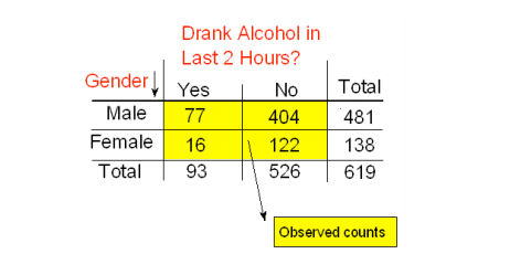
The idea behind the chi-square test, much like ANOVA, is to measure how far the data are from what is claimed in the null hypothesis. The further the data are from the null hypothesis, the more evidence the data presents against it. We’ll use our data to develop this idea. Our data are represented by the observed counts:
How will we represent the null hypothesis?
In the previous tests we introduced, the null hypothesis was represented by the null value. Here there is not really a null value, but rather a claim that the two categorical variables (drunk driving and gender, in this case) are independent.
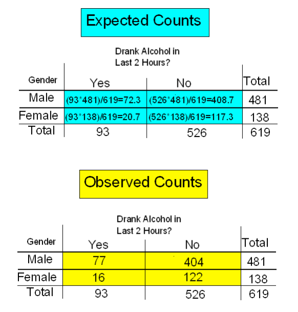
To represent the null hypothesis, we will calculate another set of counts — the counts that we would expect to see (instead of the observed ones) if drunk driving and gender were really independent (i.e., if Ho were true). For example, we actually observed 77 males who drove drunk; if drunk driving and gender were indeed independent (if Ho were true), how many male drunk drivers would we expect to see instead of 77? Similarly, we can ask the same kind of question about (and calculate) the other three cells in our table.
In other words, we will have two sets of counts:
- The observed counts (the data)
- The expected counts (if Ho were true)
We will measure how far the observed counts are from the expected ones. Ultimately, we will base our decision on the size of the discrepancy between what we observed and what we would expect to observe if Ho were true.
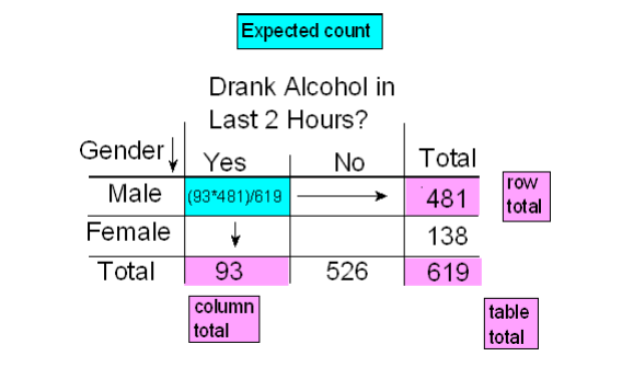
How are the expected counts calculated? Once again, we are in need of probability results. Recall from the probability section that if events A and B are independent, then P(A and B) = P(A) * P(B). We use this rule for calculating expected counts, one cell at a time.
Here again are the observed counts:
Applying the rule to the first (top left) cell, if driving drunk and gender were independent then: P(drunk and male) = P(drunk) * P(male).
By dividing the counts in our table, we see that:
- P(Drunk) = 93 / 619 and
- P(Male) = 481 / 619, and so,
- P(Drunk and Male) = (93 / 619) (481 / 619)
Therefore, since there are total of 619 drivers, if drunk driving and gender were independent, the count of drunk male drivers that I would expect to see is:
- Expected Count = 619∗P(Drunk and Male)=619*(93/619)*(481/619)=(93∗481)/619
Notice that this expression is the product of the column and row totals for that particular cell, divided by the overall table total.
Similarly, if the variables are independent,
- P(Drunk and Female) = P(Drunk) * P(Female) = (93 /619) (138 / 619)
- Therefore, since there are total of 619 drivers, if drunk driving and gender were independent, the count of drunk male drivers that I would expect to see is:
- Expected Count = 619∗(93 /619) (138 / 619)=(93∗138)/619
Again, the expected count equals the product of the corresponding column and row totals, divided by the overall table total. This will always be the case and will help streamline our calculations:
- Expected Count = (Column Total x Row Total)/(Table Total)
Here is the complete table of expected counts, followed by the table of observed counts:
Step 3: Finding the P-Value
The p-value for the chi-square test for independence is the probability of getting counts like those observed, assuming that the two variables are not related (which is claimed by the null hypothesis). The smaller the p-value, the more surprising it would be to get counts like we did if the null hypothesis were true.
Technically, the p-value is the probability of observing χ2 as least as large as the one observed assuming that no relationship exists between the explanatory and response variable. Using statistical software, we find that the p-value for this test is 0.201.
Step 4: Stating the Conclusion in Context
As usual, we use the magnitude of the p-value to draw our conclusions. A small p-value indicates that the evidence provided by the data is strong enough to reject Ho and conclude (beyond a reasonable doubt) that the two variables are related. In particular, if a significance level of .05 is used, we will reject Ho if the p-value is less than .05.
A p-value of .201 is not small at all. There is no compelling statistical evidence to reject Ho, and so we will continue to assume it may be true. Gender and drunk driving may be independent, and so the data suggest that a law that forbids sale of 3.2% beer to males and permits it to females is unwarranted. In fact, the Supreme Court, by a 7-2 majority, struck down the Oklahoma law as discriminatory and unjustified. In the majority opinion Justice Brennan wrote:
“Clearly, the protection of public health and safety represents an important function of state and local governments. However, appellees’ statistics in our view cannot support the conclusion that the genderbased distinction closely serves to achieve that objective and therefore the distinction cannot under [prior case law] withstand equal protection challenge.”
Post Hoc Tests when response variable is two levels
For post hoc tests following a Chi-Square, we use what is referred to as the Bonferroni Adjustment. Like the post hoc tests used in the context of ANOVA, this adjustment is used to counteract the problem of Type I Error that occurs when multiple comparisons are made. Following a Chi-Square test that includes an explanatory variable with 3 or more groups, we need to subset to each possible paired comparison. When interpreting these paired comparisons, rather than setting the α-level (p value) at .05, we divide .05 by the number of paired comparisons that we will be making. The result is our new α- level. For example, if we have a significant ChiSquare when examining the association between number of cigarettes smoked per day (a 5 level categorical explanatory variable: 1-5 cigarettes; 6 -10 cigarettes; 11–15 cigarettes; 16- 20 cigarettes; and >20) and nicotine dependence (a two level categorical response variable – yes vs. no), we will want to know which pairs of the 5 cigarette groups are different from one another with respect to rates of nicotine dependence.
In other words, we will make 10 comparisons (all possible comparisons). We will compare group 1 to 2; 1 to 3; 1 to 4; 1 to 5; 2 to 3; 2 to 4; 2 to 5; 3 to 4; 3 to 5; 4 to 5. When we evaluate the p-value for each of these post hoc chi-square tests, we will use .05/10=.005 as our alpha. If the p-value is < .005 then we will reject the null hypothesis. If it is > .005, we will fail to reject the null hypothesis.
Post Hoc Tests when response variable is more than 2 levels
Suppose we are examining the association between Daily Exercise Level (never, once a week, twice a week, and at least 3 times per week) and Body Image (low, average, high). Suppose further that we ran a chi-squared test that revealed that there was a significant association between Daily Exercise Level and Body Image. It begins to become even more cumbersome to run post-hoc tests! We ultimately want to know which Daily Exercise Levels are associated with higher or lower Body Images.
One way we can examine the values that vary are to look at Pearson Residuals. Pearson Residuals will inform us of whether we are getting higher or lower counts in a particular response category than we would expect if there was no relationship. As a general measure, pearson residuals greater than 2 represent relatively high counts and values less than -2 represent relatively low counts.
Correlation Test
Q→Q is different in the sense that both variables are quantitative, and therefore, as you’ll discover, this case will require a different kind of treatment and tools.
Let’s start with an example:
Highway Signs
A Pennsylvania research firm conducted a study in which 30 drivers (of ages 18 to 82 years old) were sampled, and for each one, the maximum distance (in feet) at which he/she could read a newly designed sign was determined. The goal of this study was to explore the relationship between a driver’s age and the maximum distance at which signs were legible, and then use the study’s findings to improve safety for older drivers. (Reference: Utts and Heckard, Mind on Statistics (2002). Originally source: Data collected by Last Resource, Inc, Bellfonte, PA.)
Since the purpose of this study is to explore the effect of age on maximum legibility distance,
- the explanatory (X) variable is Age, and
- the response (Y) variable is Distance
Here is what the raw data looks like:
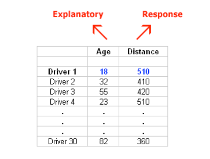
Note that the data structure is such that for each individual (in this case driver 1….driver 30) we have a pair of values (in this case representing the driver’s age and distance). We can therefore think about these data as 30 pairs of values: (18, 510), (32, 410), (55, 420), … , (82, 360).
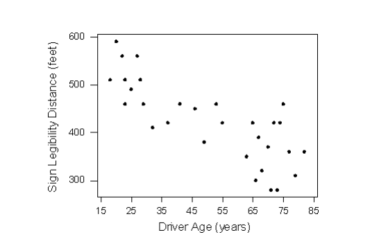
The first step in exploring the relationship between driver age and sign legibility distance is to create an appropriate and informative graphical display. The appropriate graphical display for examining the relationship between two quantitative variables is the scatterplot. Here is what the scatterplot looks like for this data:
Interpreting the Scatterplot
How do we explore the relationship between two quantitative variables using the scatterplot? What should we look at, or pay attention to?
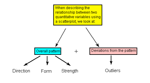
Recall that when we described the distribution of a single quantitative variable with a histogram, we described the overall pattern of the distribution (shape, center, spread) and any deviations from that pattern (outliers). We do the same thing with the scatterplot. The following figure summarizes this point:
As the figure explains, when describing the overall pattern of the relationship we look at its direction, form and strength.
The direction of the relationship can be positive, negative, or neither:
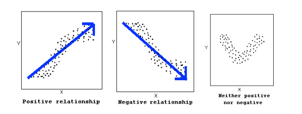
A positive (or increasing) relationship means that an increase in one of the variables is associated with an increase in the other.
A negative (or decreasing) relationship means that an increase in one of the variables is associated with a decrease in the other.
Not all relationships can be classified as either positive or negative.
The form of the relationship is its general shape. When identifying the form, we try to find the simplest way to describe the shape of the scatterplot. There are many possible forms. Here are a couple that are quite common:
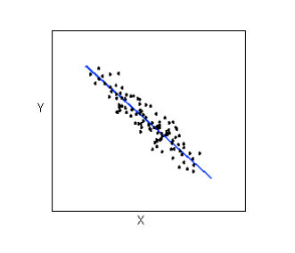
Relationships with a linear form are most simply described as points scattered about a line:
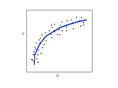
Relationships with a curvilinear form are most simply described as points dispersed around the same curved line:
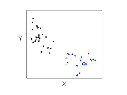
There are many other possible forms for the relationship between two quantitative variables, but linear and curvilinear forms are quite common and easy to identify. Another formrelated pattern that we should be aware of is clusters in the data:
The strength of the relationship is determined by how closely the data follow the form of the relationship. Let’s look, for example, at the following two scatterplots displaying positive, linear relationships:
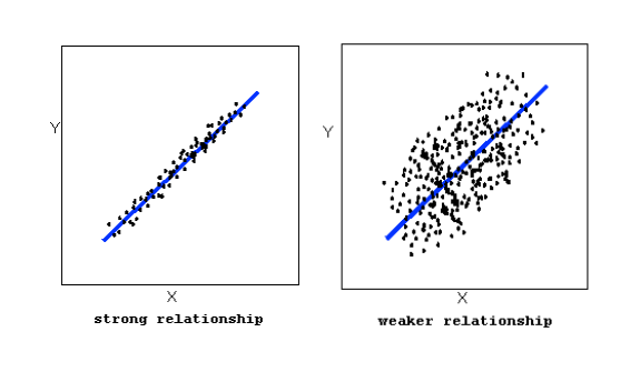
The strength of the relationship is determined by how closely the data points follow the form. We can see that in the top scatterplot the data points follow the linear pattern quite closely. This is an example of a strong relationship. In the bottom scatterplot, the points also follow the linear pattern, but much less closely, and therefore we can say that the relationship is weaker. In general, though, assessing the strength of a relationship just by looking at the scatterplot is quite problematic, and we need a numerical measure to help us with that. We will discuss that later in this section.
Data points that deviate from the pattern of the relationship are called outliers. We will see several examples of outliers during this section. Two outliers are illustrated in the scatterplot below:

Let’s go back now to our example, and use the scatterplot to examine the relationship between the age of the driver and the maximum sign legibility distance. Here is the scatterplot:
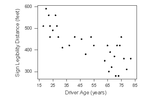
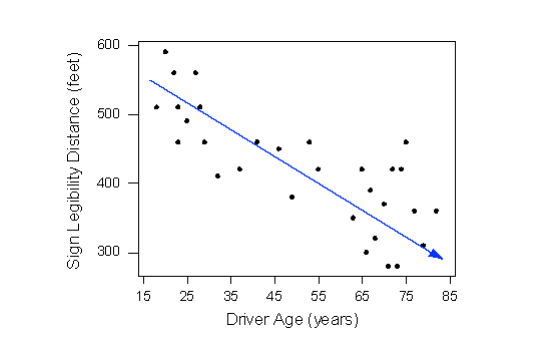
The direction of the relationship is negative, which makes sense in context, since as you get older your eyesight weakens, and in particular older drivers tend to be able to read signs only at lesser distances. An arrow drawn over the scatterplot illustrates the negative direction of this relationship:
The form of the relationship seems to be linear. Notice how the points tend to be scattered about the line. Although, as we mentioned earlier, it is problematic to assess the strength without a numerical measure, the relationship appears to be moderately strong, as the data is fairly tightly scattered about the line. Finally, all the data points seem to “obey” the pattern—there do not appear to be any outliers.
The Correlation Coefficient—r
The numerical measure that assesses the strength of a linear relationship is called the correlation coefficient, and is denoted by r. We will:
- give a definition of the correlation r
- discuss the calculation of r,
- explain how to interpret the value of r, and
- talk about some of the properties of r
Definition: The correlation coefficient (r) is a numerical measure that measures the strength and direction of a linear relationship between two quantitative variables.
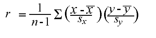
Calculation: r is calculated using the following formula:
However, the calculation of the correlation (r) is not the focus of this course. We will use a statistics package to calculate r for us, and the emphasis of this course will be on the interpretation of its value.
Interpretation and Properties: Once we obtain the value of r, its interpretation with respect to the strength of linear relationships is quite simple, as this walkthrough will illustrate:
Highway Sign Visibility
Earlier, we used the scatterplot below to find a negative linear relationship between the age of a driver and the maximum distance at which a highway sign was legible. What about the strength of the relationship? It turns out that the correlation between the two variables is r = -0.793.
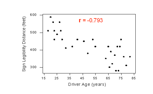
Since r < 0, it confirms that the direction of the relationship is negative (although we really didn’t need r to tell us that). Since r is relatively close to -1, it suggests that the relationship is moderately strong. In context, the negative correlation confirms that the maximum distance at which a sign is legible generally decreases with age. Since the value of r indicates that the linear relationship is moderately strong, but not perfect, we can expect the maximum distance to vary somewhat, even among drivers of the same age.
Statistics Courses
A statistics department is interested in tracking the progress of its students from entry until graduation. As part of the study, the department tabulates the performance of 10 students in an introductory course and in an upper-level course required for graduation. What is the relationship between the students’ course averages in the two courses? Here is the scatterplot for the data:
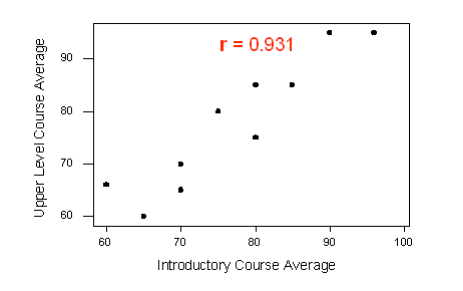
The scatterplot suggests a relationship that is positive in direction, linear in form, and seems quite strong. The value of the correlation that we find between the two variables is r = 0.931, which is very close to 1, and thus confirms that indeed the linear relationship appears very strong.
Assessment of r in a hypothesis test
Now that we can interpret the correlation coefficients that we obtain, we will want to know whether the correlation coefficients indicate a significant linear relationship.
The hypotheses we are testing are:
- H0: There is no linear relationship between X and Y (r=0)
- Ha: There is a linear relationship between X and Y (r≠0)
As before, a small p-value will suggest that there is enough evidence to reject the null hypothesis. This will suggest that there is a significant linear relationship between X and Y. The output of a correlation test will typically produce the sample correlation coefficient (r), the test-statistic (t), and the p-value.
Example:
Suppose we would like to examine the relationship between IQ score and GPA. We begin by examining the following plot:
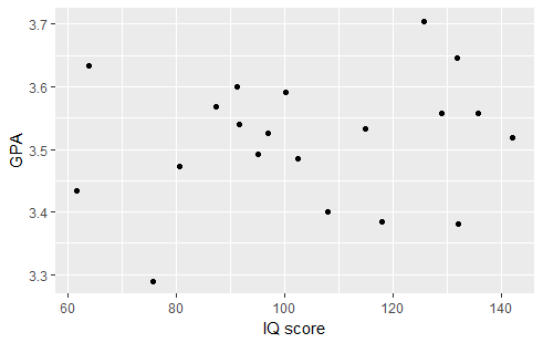
There appears to be a very slight positive relationship between the two variables. Therefore, it was not surprising to find a correlation coefficient of r=0.1746. Testing the relationship we find the following output:
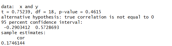
The correlation coefficient r=0.1746 is not significantly different from 0 (t=0.7523, p-value=0.4615). Therefore, there is not enough evidence to suggest that there is a linear relationship between IQ score and GPA.
Please watch the following two videos (Chi-Square and Correlation)
- R
- SAS
- Stata
Chi-Square
Correlation
Chi-Square
Correlation
Chi-Square
Correlation
Please take Quiz 9 here.
Post-Class Tasks
Mini-Assignment 6
Project Component H: click here